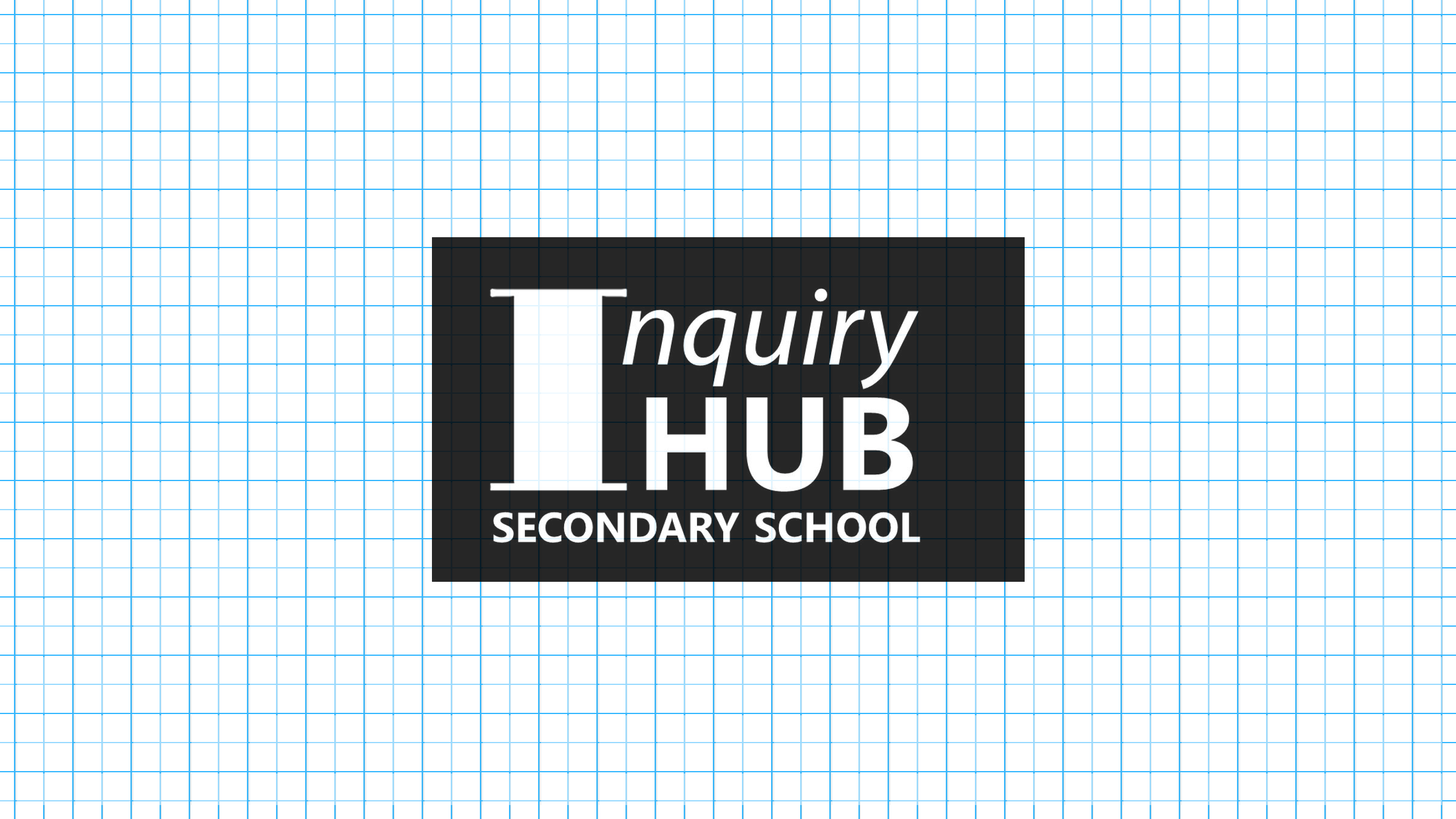
For the first three and a half years of Inquiry Hub, the school had a complex, institutional black-and-white, typographic logo. But in the fourth year of iHub, two grade nines, Alin and Laef, set out to change that.

Inquiry Hub’s old logo, used for the first three and a half years
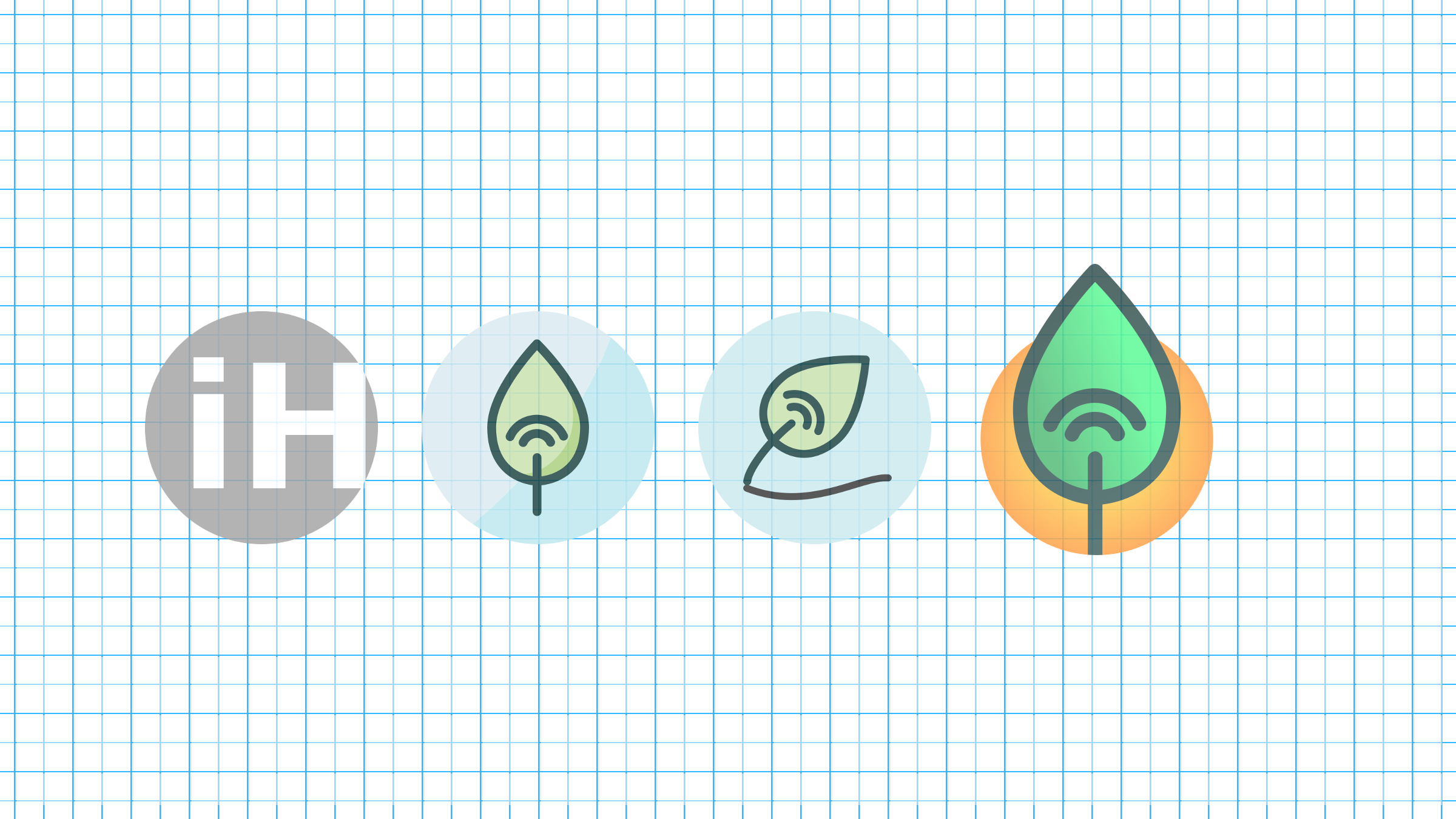
Starting mid-December, they worked with then Digital Media teacher Mr. Khalili to conceive of a new logo. Various designs were tossed around, but as time went on, the ones that stuck included a leaf, representing the Garden, and wifi waves, representing the school’s technological aspect.
The first design created by Alin containing the leaf and wifi waves was placed on a circular blue background. Working with Mr. Sarte and Mr. Soiseth, this design was revised first to use an orange background instead, and then to scale the orange circle down to create a two-thirds edge tension with the leaf.

Revisions of the Inquiry Hub Logo
While Mr. Truss worked to make the logo official, teachers began using the new logo on documents and assignments, slowly bringing the new brand to the forefront. Alin continued to create different versions of the logo for various purposes, such as printed documents and social media. And, in Year Five, the logo was the basis for the new design of the school website created by Laef.


